Monday 21 March 2011

MARTIN GALLE: Post New Leipzig School

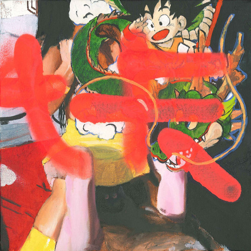
I first encountered the paintings of Martin Galle in Sharon Butler’s report on the Volta Art Fair in NY, on her blog, Two Coats of Paint, on the 8th of March. Without knowing anything about him, the work illustrated, Return of the Mac (2010 - 90 X 120 ins, oil on canvas) instantly stood out for its enigmatic content, its technical dexterity, its poise or touch. It was love at first sight, really. The work was not about the quick and easy or obvious, unlike most of the selections, but nor did it feel wilfully obscure or merely esoteric. Rather, it rewarded attention to careful differences in treatment and iconography.

I later found gallery commentary interpreted it as a portrait of a graffiti artist (such as Galle, apparently) with a carrier-bag full of spray cans - a fairly cheerful salute to covert painting of a dubious kind. ‘Mac’, presumably was his tag, ostensibly, the surrounding ground, his target. Although there was nothing to actually identify the contents of the carrier bag as spray cans and tagging the ground in a wood only begged more questions. Painterly treatment of the wood hardly guaranteed that the brilliant colours to the ground were the work of spray cans, and the elaborate disguise hardly seemed warranted in such seclusion. It called for a rethink, a long look. It guarded its approach, much as the character in the foreground guarded their identity. But there was definitely a whiff of the deep and different.

I somehow sensed he was not American, in a way that, I did not, for example, with (German) Manfred Schneider, whose work was also included in Butler’s selection. It did not surprise me to learn subsequently that Galle was German, around thirty, and from Leipzig. Although it did surprise me he had recently completed a master’s degree, supervised by Neo Rauch, and that he is based in the famous Spinnerei complex of studios on the outskirts of Leipzig, where Rauch, his wife, Rosa Loy, and associate, Tilo Baumgartel also work.

Galle’s work has none of the emphatic, linear quality one associates with the New Leipzig School, whether Rauch (particularly the 90s work), Ruckhaberle, Eitel or Baumgartel, few nods to stolid print illustration or graphics, or to art history, little of the emphasis on architecture or design. Instead, Galle often uses frankly photographic sources, something shunned by the New Leipzig School, as well as wilderness settings, cartoon characters, such as Mickey Mouse, acrylics (rarely used as a rule), spray paint and gestural abstraction, in various combinations. The work varies greatly in scale, technique and theme, falls into small groups, suggesting a skittish, restless temperament. Potentially, Galle claims a much wider ambit, asks something quite different of painting. Possibly the work deserves the title of Post New Leipzig School.

Then again, at this stage, it may be that the artist has simply failed to focus his enthusiasms and indulges a formidable technical facility. It is probably too early to tell. Looking to his gallery’s website (ASPN - also based in the Spinnerei) I found about a dozen examples of Galle’s work from the past few years, and via Google, older work, with which to glean some sense of a project.. Further research revealed Galle’s emergence has been flagged for the past few years, on the Artlab 21.org site, on Florida-based art consultant, Misti Wilson’s blog and currently with the publication of Rising: Young Artists to keep an Eye on! by Olaf Salie, amongst other sources.

With the Rauch connection in mind, I could detect some influence perhaps, in the use of stereotypes and public or theatrical gesture in Anbetung (2010) or Verzweiflung (2008) and spectacle, such as Rummelnight (2009) and Lady Transformers (2009) with their fairground settings. But where Rauch constructs an implausible, even surreal tableau that taxes the picture’s style or integrity, Galle favours a looser, more disparate construction that holds little of that tension. Instead, his works tend to distance or disperse the person, so that they are no more than a literal construction, as in Man with a Beard (2009) or Kleiner Sommeridiot (2010). There, one does not deal with people in difficult situations but rather, people themselves present a difficulty. They are merely abstractions or substitutes at best, incapable of a real situation, mere games or toys. Hence too, the distance to the figures in Anbetung (Worship) and Return of the Mac with their remote locations, their disguise or performance. The person is kept at arm’s length in his approach.

Nor is it coincidence that these two examples situate the figures deep in nature. The contrast is not so much between the natural and obvious, opposed to the cultivated and concealed, but rather with the conspicuously posed versus the discreetly composed. The wilderness settings are equally subject to arrangement, simplification and stylisation. While based upon photographic sources (light contrasts and tonalities preserve this) Galle strips them down to a quick impression or deft technique. They are an impression of photography, at its most natural. The picture becomes a hasty, if bravura, over-writing of realism, an opportunity for sweeping amendment or forestalling more demanding engagement. The echoes with graffiti thus carry through to painting generally, to a view of the artist as furtive editor, casual adjustor of unwelcome orthodoxies. If graffiti is not necessarily evident in Return of the Mac, it is explicit in the spray-can gestures of Brand 2(2010) and Shen Long is Coming (2010) as well as earlier works such as Untitled - or Donald (2006). Elsewhere, Galle toys with spray stencils that similarly impose themselves upon a more traditional, even kitsch landscape, as in Liquor Sunset (2009).

Yet, while these examples grant graffiti many of the values of abstraction and an implicit appeal to fundamentals of painting, they nevertheless resort to glib and juvenile gestures, the mark of the petulant and selfish. As a détournement, it is a bit of a dead end. There is a telling correspondence with Galle’s depiction of people as essentially tokens or toys, requiring only superficial engagement, appealing to simplistic roles. In this respect, painting points directly to character and character is on the run and undercover. And in this respect, Return of the Mac acknowledges both a troubling psychological dimension and an implicit aesthetic, in ways earlier work cannot. The cartoon eyes on the cap worn by the figure, for example, signal this aspiration to a loveable icon, a comfortable mask, but the bulk beneath it now illustrates the baggage that goes with it. Whether it signals a new maturity and growing integration of the artist’s interests remains to be seen. In any case, the New Leipzig School stands to be renewed.


This article also appears @ Worldwidereview.com

Tuesday 8 March 2011

BAD PAINTING

This is an article I wrote for Wikipedia, but I’m publishing a version here that uses links to the reproductions of works discussed, from the New Museum of Contemporary Art site, something discouraged on Wikipedia. I've kept all the tedious 'internal' links required of Wikipedia entries, since I've already collected them, but this preference for an 'internal' network seems counter to the spirit of the net and the web, and I don't see that it guarantees validity or veracity anyway. And I doubt my version will stay unaltered very long there.

“Bad” Painting is the name given to a trend in American figurative painting in the 1970s by critic and curator, Marcia Tucker (1940-2006). She curated an exhibition of the same name, featuring the work of fourteen artists, most unknown in New York at the time, at the New Museum of Contemporary Art, New York, from January 14th to February 28th, 1978. “Bad” Painting[1] was not a demonstration of technical incompetence, poor artistic judgement, amateur or outsider dabbling, although the term is commonly used for these. For Tucker, it denoted a more focused or deliberate disrespect for recent styles. The press release for the exhibition[2] summarised “Bad” Painting as ‘…an ironic title for ‘good painting’, which is characterized by deformation of the figure, a mixture of art-historical and non-art resources, and fantastic and irreverent content. In its disregard for accurate representation and its rejection of conventional attitudes about art, ‘bad’ painting is at once funny and moving, and often scandalous in its scorn for the standards of good taste.’ ‘Bad’ here, is thus a term of approval for the more eccentric and amusing variations on certain accepted styles, at that time.

Artists

Artists included in the exhibition were James Albertson (b. 1943), Joan Brown (1938 – 1990), Eduardo Carrillo (1937 – 1997), James Chatelain (b. 1947), Cply (alias William Copley) (1919 – 1996), Charles Garabedian (b. 1923), Robert Chambless Hendon (b. 1936), Joseph Hilton (b. 1946), Neil Jenney (b. 1945), Judith Linhares (b. 1940), P. Walter Siler (b. 1939) , Earl Staley (b. 1938), Shari Urquhart (b.1938), and William Wegman (b. 1943).

Style

On paper, Tucker’s criterion for “Bad” Painting is rather generous, allowing merely that “The artists whose work will be shown have discarded classical drawing modes in order to present a humorous, often sardonic, intensely personal view of the world” (see press release in external links to the New Museum of Contemporary Art’s website). But this alone would simply permit work with Expressionist or Surrealist tendencies, not to say caricature, styles already well established within a canon of good taste. In practice though, Tucker’s criterion is much stricter, and excludes for example, the established Expressionism of a Leon Golub (1922 - 2004) or Jack Levine (1915 - 2010), the caricature of a Peter Saul (b. 1934) or Philip Guston [3] (1913 – 1980), the fantasy of later Honoré Sharrer (1920 – 2009). Some further condition was obviously at work in her criterion.

In the catalogue essay, a context of the preceding fifteen years is sketched, in which Minimalism and Photo-realism represent a prevalent ‘classicizing’ style for America and against which “Bad” Painting presents a challenge (although not a movement).[4] At best, this explains the selection as a retreat from photographic or ‘classicizing’ standards for figuration to an older style. Tucker identifies a shared theme of iconoclasm, and a preference for parody and antagonism for her selection,[5] but again, these are qualities common to Expressionism and Surrealism, and even some Photo-realism.[6] A further feature noted is the use of ‘non-high-art sources’, the most prevalent being comics.[7] Yet curiously, Tucker makes no mention of Pop Art, as inspiration or opposition. High and non-high (or low) art cannot be a matter of imagery or iconography, since high-art features as much irreverence and caricature as it does realism and veneration (for example, the work of Goya or Daumier, Lautrec or Arcimboldo). Nor can the difference rest purely upon technique, since paintings may be high or low art. Yet, comics as a source, along with other commercial illustration cited, surely separates “Bad” Painting from earlier Expressionism and Surrealism, surely picks out a crucial trait across this otherwise disparate group. Tucker’s essay cannot quite put her finger on it, but one might tease this out by considering preceding developments in figurative painting in the 1960s and 70s, a little closer.


While art historical allusion, humour and fantasy are undoubtedly features of her selection, more precisely, they arise in deliberately citing popular print or publication sources, albeit with increasing distance or restraint. The strand to figurative painting discerned by Tucker surely derives from the styles of Pop Art, Pattern & Decoration, The Hairy Who, and affiliated Chicago groups, and Californian Funk Art. One way of understanding “Bad” Painting is to notice how these preceding styles progressively depart from common or mass print imagery, while spelling out crucial differences between painting and prints – defining painting. In this way, they disclose telling differences in meaning between the two, even when imagery remains much the same. Tucker rightly senses this project travels in tandem with Minimalism, but without quite grasping the consequences. “Bad” Painting signals a further and final dissolution to this project, is an end rather than a beginning.

To briefly summarise the development - the use of cartoons and banal illustrations in the work of Pop Art pioneers, such as Andy Warhol (1928 – 1997) and Roy Lichtenstein (1923 – 1997), soon prompted painting from other kinds of cartoon and illustration and other qualities of painting with which to highlight such sources. The Hairy Who, for example, broadens the project, arriving at more stylised or abstracted cartoon captions and characters, although their inspiration is as much naïve and outsider art as the graphics of Pop Art. However, their wider acceptance with shows between 1966 and 68 surely reflects a momentum created by the success of Pop Art. Funk Art in San Francisco, as in the work of William T. Wiley (b. 1937), similarly continued to mine a strong illustrational style devoted to fine, continuous outline and mainly flat colours, even as it adopted less familiar content. In both cases, the work maintains a cool detachment in manner, as painting, even as its content is much less obviously popular or commonplace. Pop Art is also quick to use art historical references, such as Warhol’s Mona Lisa or Lichtenstein’s Mondrian and Cezanne illustrations, as a way of driving home the point about painting and print’s differences. Subsequent allusion in following styles to famous paintings, inherits some of this irony, although the project steadily dilutes, turns ‘bad’.

Pattern and Decoration (P&D) actually derives from Minimalist abstraction, but through progressive expansion to compositional formats of basic symmetries and stripes, soon allows overlapping planes – a minimal depth – then shadows or volume, then more concrete objects in symmetrical patterns, and with these a measure of figuration. Patterns of repeating pictures, or serial motifs, are eventually a prominent feature of the style. Sources become textiles and other printed matter, such as wallpaper or wrapping paper. With these, P&D converges with Pop Art and following styles, dissipates as a project, or turns ‘bad’ in the hands of fringe practitioners. P&D sources often carry an additional vulgar or kitsch quality with their earnest, sentimental motifs, once these are removed from a print context and scrutinised as painting. Kitsch, in these cases, becomes something like a badge for the extended exploitation of prints and pattern by painting, a sign of the project’s exhaustion.

With these precedents in mind, Tucker’s examples of “Bad” Painting may be divided into roughly four groups. To be clear, Tucker does make this division in either her essay or exhibition. What is offered here is simply a demonstration of the consistency of her selection, even as her description proves misleading or inadequate. The first group (in no particular order) brackets works that highlight illustrational styles derived from print sources, although more remotely than Pop Art. The works by Albertson, Carrillo, Hilton and Staley favour this. Note: reproductions of examples cited here, can be found on the New Museum of Contemporary Art’s website, listed in the external references below. Albertson’s mock symbolic or allegorical scenes, such as Memento Mori (1975) Sex, Violence, Religion + The Good Life (1976) and The Triumph of Chastity (1976) all supply humorous content in contrast with earnest titles, in a broad-brushed style, akin to movie posters or magazine illustration of an earlier era. Carrillo’s large-scale Los Tropicanas (1974) presents a futuristic scene peopled with glowing skeletons, female nudes and a strangely mechanical bird. By iconography rather than technique, the work alludes to science fiction as much as Surrealism and to a genre native to print. It is the clash or confusion to style here that signals a poverty or ‘badness’ to standards. Also of note, the drawing to figures in both Albertson and Carrillo does largely maintain classical proportions and foreshortening, contrary to Tucker’s sweeping claims. Hilton’s architectural scenes, feature precision and projections akin to the work of Roger Brown (1941 – 1997), a key Chicago Imagist, and add equally stylised figures, much as architectural illustration uses. All four artists extend the derivation from print styles to less obvious means, less compelling features. The work is ‘bad’ in comparison with Pop Art, for pursuing techniques and imagery to trivial or nugatory ends for painting, for blurring or obscuring reference in prints. This is something Tucker’s catalogue essay actually celebrates, a point to be returned to presently.

The second group brackets the work by Cply and Siler, whom retain the strong outlines of comic-strip or animated cartoon figures, stylised drawing and mostly flat colours. Although, Cply’s figures are notably looser in drawing than most comic- strips, while the attention to pattern and a decorative flattening in projection also aligns the work with P&D. In some examples, ribald subject matter pose something of an extension to the genres, presents a more eccentric extension. Siler’s equally casual arrangements, such as Spookie Stove (1976) share affinities with Chicago artists such as Karl Wirsum (b. 1939) and Gladys Nilsson (b. 1940), as well as Funk artists, such as the watercolours of Wiley from the late 1960s. The combination itself is a symptom of a growing diffusion, a weakening distinction for both styles. The work is ‘bad’ for its minor variation, its feeble allusion.

The third group brackets works by Brown, Garabedian, Hendon, Linhares, Urquhart and Wegman, where a derivation from P&D is foremost. Here, more decorative, frontal motifs often emphasise fabric supports, in works such as Urquhart’s Interior with Sugar Talk (1977) and Hendon’s tapestry-like Mallard with Friend (1977). Repeating motifs are incorporated as a bold wall paper in Interior with Sugar Talk, but the focus for this group is mainly upon the picture as a single, central motif, often with a border or frame, as in Linhares’ Turkey (1977), Garabedian’s Adam and Eve (1977). Works are generally executed in broad, open or loose brushstrokes, bright colours, a staple of textile design. Brown’s work from this time often features patterned borders along the bottom of the picture; however, examples selected for “Bad” Painting concentrate instead on the centralised motif, flat colours and an oblique projection to the surrounding space. In Woman Wearing a Mask (1972) – one of the standouts to the show – it is presumably the attention given to modish black lace lingerie and high heels, content that recalls advertising, included within a more relaxed composition, that appealed to Tucker. The witty, trompe-l'œil cat mask (a flattened picture within a flattened picture) worn by the woman, is also executed in the casual brushstrokes favoured by textile design. The picture thus shares an insouciant confluence of styles, an amusing ‘badness’. Again though, it is worth noting that Brown’s drawing of the figure in this example is traditional in proportion and modelling, contrary to Tucker’s prescription.

The fourth group brackets the work of Jenney[3] and Chatelain, where vigorously brushed grounds to central, simple motifs are prominent. The derivation is not so much to Pop Art and print sources, but to Jasper Johns’ (b. 1930) use of stencils and templates, filled with short, broad, impasto strokes. Stencils, like prints, afford multiple instances and establish strict conventions in wide use, acquire a certain authority for it. They are essentially designs, whether of the American flag or a target. John’s compliance with them remains rugged but respectful, or highly ambivalent. His work from the 1950s is usually seen as an important precursor, if not initiator, of Pop Art. Jenney’s work from the late 1960s, such as Girl and Vase (1969), exchanges stencils for simple outlines, usually of a familiar or topical object. Yet the structure retains some of Johns’ ambivalence. The precise outline constrains boldly brushed filling in narrow areas or shapes, while in broader, less defined areas, allows the brushwork greater prominence, so that it undermines content there, creates a decorative or detached ground. Significantly, Jenney described this development[4] as ‘bad drawing’. But Jenney’s selection for “Bad” Painting is curious, in that the work was nine years old at the time of the exhibition, and widely recognised. However, Tucker’s selection concentrates on examples where the object or drawing style loses some of its familiarity and gives the rugged treatment a more mannered, arbitrary quality. A Chatelain example such as Untitled (1977) extends this development, so that figures have become more cursory, perhaps Expressionist. Any rationale for the stooping figure on the left of the picture, for example, is now lost and the surrounding ground, granted even greater latitude to impasto brushstroke and colour. Once more, the work exhausts a seam of rigid iconography and painterly treatment, arrives at a ‘bad’ icon, or an icon treated ‘badly’.

All four groups thus trace a steady diffusion to print sources and the means with which painting distinguishes itself from them. The stylistic lineage offered here demonstrates a greater coherence and articulation than Tucker’s catalogue essay, and indicates several inaccuracies to her description, but essentially confirms her choices. “Bad” Painting remains a useful style with which to survey American figurative painting toward the end of the 1970s. Tucker’s sense of an emerging post modern era was in part true, in as much as she detected a pervasive dissolution, but “Bad” Painting did not announce the end of progress, or further development in painting, as she supposed (see quote below). The style itself was too diffuse, too peripheral, geographically and stylistically, to exert a decisive influence.

Influence

It is clear from her catalogue essay, that Tucker saw “Bad” Painting as a dilemma for notions of progress and assessment. ‘The freedom with which these artists mix classical and popular art-historical sources, kitsch and traditional images, archetypal and personal fantasies, constitutes a rejection of the concept of progress per se. . . . It would seem that, without a specific idea of progress toward a goal, the traditional means of valuing and validating works of art are useless. Bypassing the idea of progress implies an extraordinary freedom to do and to be whatever you want. In part, this is one of the most appealing aspects of "bad" painting - that the ideas of good and bad are flexible and subject to both the immediate and the larger context in which the work is seen.’ (see external link for reference).

Unfortunately, Tucker does not supply this larger context, in which one might see a ‘progression’ of figurative painting styles up to 1978. Nor does she acknowledge that ‘the extraordinary freedom’ accorded the artist under such an arrangement is also useless, if standards for individuality multiply with number of individuals. Flexibility and subjectivity on these terms becomes excessive. Indeed, the development Tucker sketches might also be described as a drastic dissolution for the critic, whereby each work must be accorded its own style, each style applied only to one work. Comparison or assessment thus becomes futile. Badness, on these terms, has little to recommend it.

"Bad" Painting is sometimes seen a precursor to the wider movement of Neo-Expressionism that follows in the early 80s, a style with branches in Germany, Italy and France, amongst other nations. But there are important differences. Tucker’s selection does not concentrate upon large-scale works, featuring broad, urgent facture, applied to allegorical or metaphorical themes, frequently political or historical. Her selection is more wide-ranging. “Bad” Painting shares none of the shrillness, the social provocation often found in Neo-Expressionism. “Bad” Painting is typically more restrained, in scale and scope, more light-handed in touch, light-hearted in sentiment. Similarly, “Bad” Painting is often associated with New Image Painting[5], another trend in figurative painting defined by an exhibition later in 1978, curated by Richard Marshall. But there, the trend is focused upon New York-based artists and a derivation closer to that outlined for Jenney, who was also included.

Where “Bad” Painting does find later resonance is with the publication of Thrift Store Paintings [13] by the painter Jim Shaw in 1990. As the title suggests, Shaw’s collection is drawn from humble, second-hand sources, rather than an explicit criterion of badness. But the collection is not concerned with surprising bargains for the conventional art collector. On the contrary, it is a catalogue of discarded or rejected tastes. It amounts to ‘bad’ painting, in the more general sense, of poor judgement, technical incompetence or outsider indulgence. Its appearance and impact in 1990 demonstrates a further plurality to figurative styles of painting, an extension to “Bad” Painting, although not an exhaustive one. Because of the priority given to place of purchase in Thrift Store Painting, works are mainly easel-scale and devoted to traditional themes, factual and fictional. There is no place for ‘bad’ Minimalism on a site-specific scale or geometric abstraction, for instance, no works abandoned by recent ambitious art students or failed post modernists. Thrift Store Paintings is devoted to the peripheral, the clumsy and comic, as was Tucker’s “Bad” Painting. The difference is that Shaw allows a wider array of figurative styles, from the Naïve to Surreal or Expressionist, the Photo-realistic to Pop or decorative. But again, importantly, works are never wholly of one style; instead, hover uncomfortably or ‘badly’ between conflicting categories, summoning too many standards, too weakly. Thrift Store Paintings is rarely linked to “Bad” Painting in published criticism, however.

Shaw’s publication was received favourably and led to later exhibitions. Critics still occasionally revile them[6], but this is perhaps to miss their sophisticated appeal, their potent suggestion. Their acceptance also coincides, and possibly prompts work by John Currin (b. 1962), Lisa Yuskavage(b. 1962) and George Condo (b. 1957), for example, where the focus is upon portraiture and stereotypes, much like Thrift Store Paintings, but provides a more directed mix of technical virtuosity with vulgarity, caricature with idealism, stylisation with realism. Such work is sometimes associated[7] with ‘bad’ painting, for degrading or conflating traditional iconography, but the difference lies in a narrowed scope for these later artists. Fewer ‘bad’ elements are managed within a more obvious structure, are ‘bad’ perhaps in anatomy or drawing, but ‘good’ in volume or tone, colour or composition. Such work remains popular but generally earns no more precise grouping than Post Modern. By contrast, ‘bad painting’ has been invoked by the artist Albert Oehlen (b. 1954) for dual exhibitions, contrasting bodies of work dedicated to ‘bad painting’ and ‘good painting’. But Oehlen’s concern is really with accommodating figuration and abstraction within the same work, with demonstrating degrees or a spectrum between them. Good and bad here fall between a purity of means – formal or intrinsic properties to painting – and impurity of ends – extrinsic content to a picture. This is a far broader criterion for figurative painting than Tucker’s “Bad Painting” or related subsequent developments and gains little by an association.

Finally, the influence of “Bad” Painting was not immediate or sustained, on American painting or internationally. Albertson, Carrillo, Chatelain, Hendon, Hilton, Siler and Staley achieved no wider recognition. However, the style anticipated a growing interest in other kinds of pictures for painting, not exclusively predicated upon print models, not exclusively private or remote.

References

[1]Jerry Saltz, A Pettibon Primer, Village Voice, March 23, 1999, in Seeing Out Loud: The Village Voice Art Columns, Fall 1998 - Winter 2003, Geoffrey Young, 2003, p376. ISBN 1930589174
[2]Marcia Tucker, Press Release for "Bad" Painting,
New Museum of Contemporary Art, New York 1978.
[3] Marcia Tucker, "Bad" Painting, catalogue, New Museum of Contemporary Art, New York, 1978, Footnote 33.
[4] ibid Unfortunately the catalogue has no page numbers, numbers given here count the pages from the first page of Tucker's essay, "Bad" Painting - p. 3, p.17.
[5] ibid p.7, p.15, p.17.
[6]See for example, the work of John Clem Clarke in Gregory Battcock, Super Realism: A Critical Anthology, Dutton, New York, 1975 p.39.
[7] Marcia Tucker, "Bad" Painting, in James Albertson et al., "Bad" Painting, catalogue, New Museum of Contemporary Art, New York, p. 13.
[8]Kay Larson, The Good, the Bad and the Ugly, New York Magazine, April 20, 1987
[9]Roberta Smith, ART REVIEW;
And When He Was Bad, He Certainly Was Busy, New York Times, March 30, 2001.
[10]Richard Marshall, New Image Painting, Whitney Museum of American Art (catalogue) New York, December 1978 - January 1979.
[11]Charles Darwent, Good. Bad. It's all the same in the end, The Independent, July 16, 2006.
[12]Eva Badura-Triska et al, Bad Painting – good art , exhibition catalogue, Museum Moderner Kunst, Vienna, 2008.
[13] Thrift stores are cited as a source of inspiration in Tucker, James Albertson et al., "Bad" Painting, catalogue, New Museum of Contemporary Art, New York, 1978, p. 1, p.13.


Further Reading

• Faust, Wolfgang Max & de Vries, Gerd, Hunger Nach Bildern: deutsche malerei der gegenwart, Dumont Buchverlag, Cologne, 1982.
• Fineberg, Jonathan, Art Since 1940: Strategies of Being, Laurence King, London and NY. 2000.
• Hopkins, David, After Modern Art 1945 – 2000, Oxford University Press, London, 2000.

• Battcock, Gregory, Super Realism: A Critical Anthology, Dutton, New York, 1975